A free-to-play game depends on its store. This one had to do justice to the Mechs it was selling.
I joined Piranha in 2013, shortly after MechWarrior Online launched. Products were sold through mwomercs.com, a site whose structure has not changed since, although the product pages never stopped evolving. Mech pack sales funded the game's development, so the purchase flow mattered more than almost anything else I worked on.
A review of the early product pages found plenty to fix: heavy, unoptimised images, no real mobile view, missing hover states, unexpected rollovers, and a sign-in requirement that only appeared after pressing Buy. The Mechs themselves, the whole point of the page, were shown too small to make an impression.
One decision went against the prevailing advice: we designed desktop-first. Mobile-first was the standard recommendation, but under 20% of our traffic was mobile. This was a PC game, installed from this very site, and the art called for it: Mechs are drawn to be seen large, with every detail on display. Desktop received the best version, and media queries scaled it down with care.
The redesign centred on a full-height carousel: uncropped Mech art, a thumbnail rail for moving between variants, and smaller image sets served to smaller screens. Desaturated backgrounds let the pack's original skins stand out.
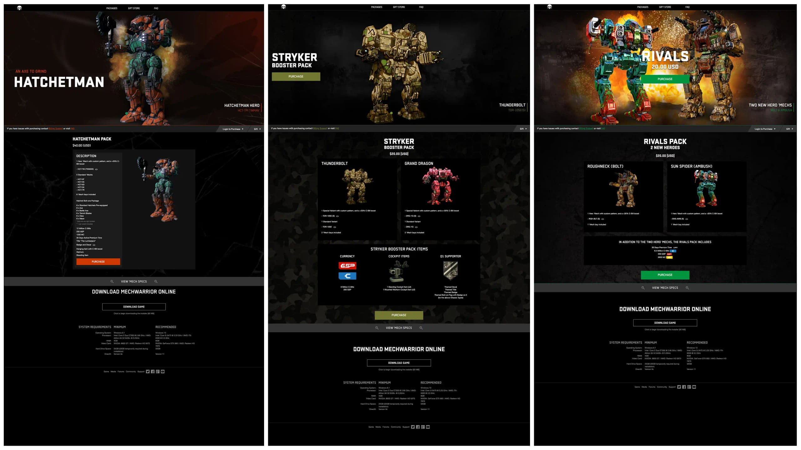
A sticky navigation bar beneath the carousel held the important actions: sign-in, and later a gifting button that players had asked for and which proved popular. Each pack was also given its own strapline to match its theme, a practice the live-ops team still keeps up.
Below the fold sat the pack contents and Mech specifications (hardpoints, tonnage and weapon groups) in click-to-reveal menus, along with a countdown on the carousel for the early-buyer bonuses that expired once a pack reached the in-game store. It was a long page, so the sticky navigation also carried a back-to-top link.
We then spent a decade removing things. The data showed that nobody used the social icons or the newsletter sign-up, so they went. Specifications collapsed into a single reveal. Old packs came off the page altogether. Every removal made the current offer easier to see. The best product page turned out to be the one with the least on it.
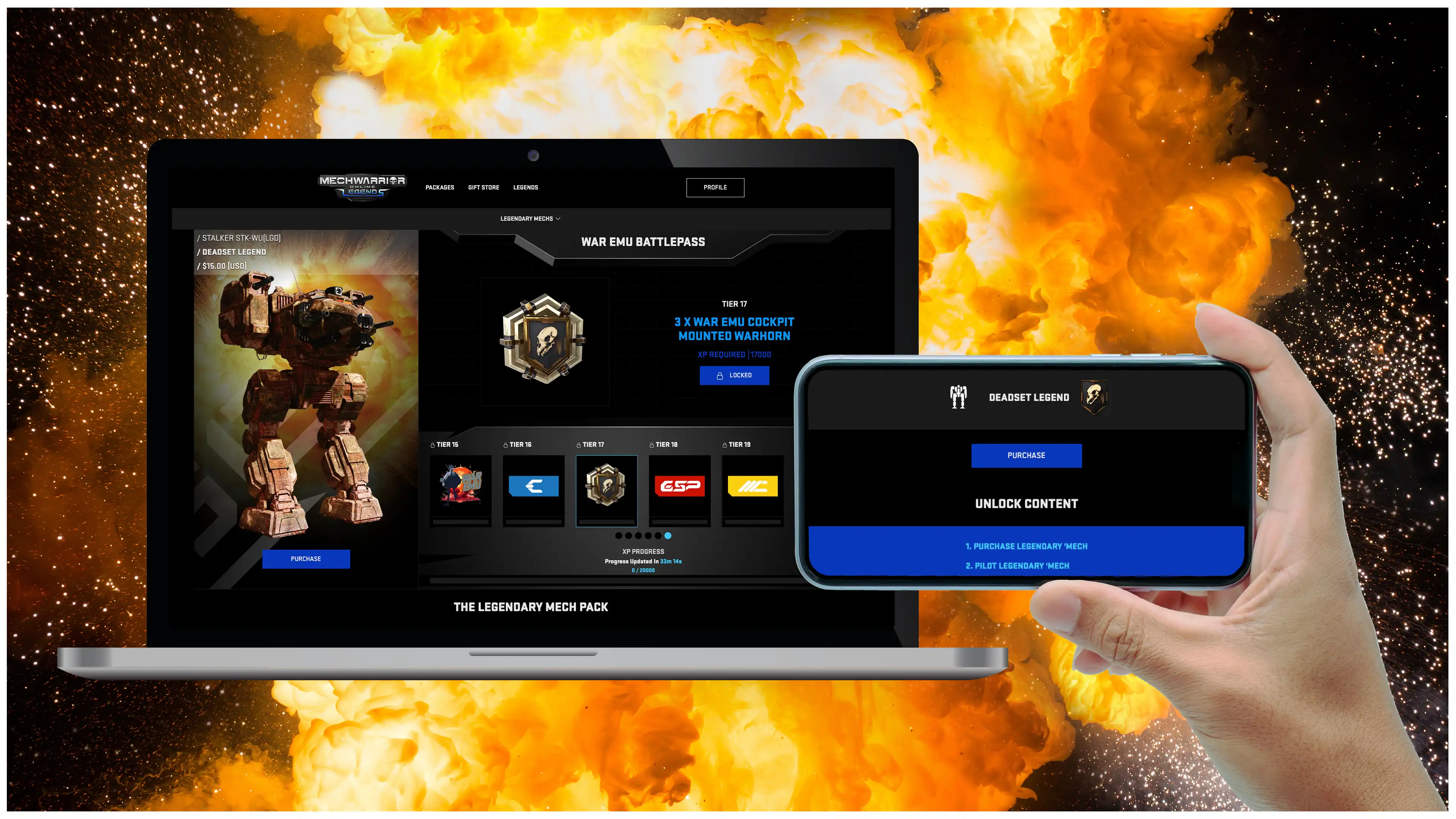
The 2023 rebrand was followed by a battlepass: buy a Mech, play it, and it continues to earn rewards. It needed a new page pattern, built on what the previous ten years had taught us.