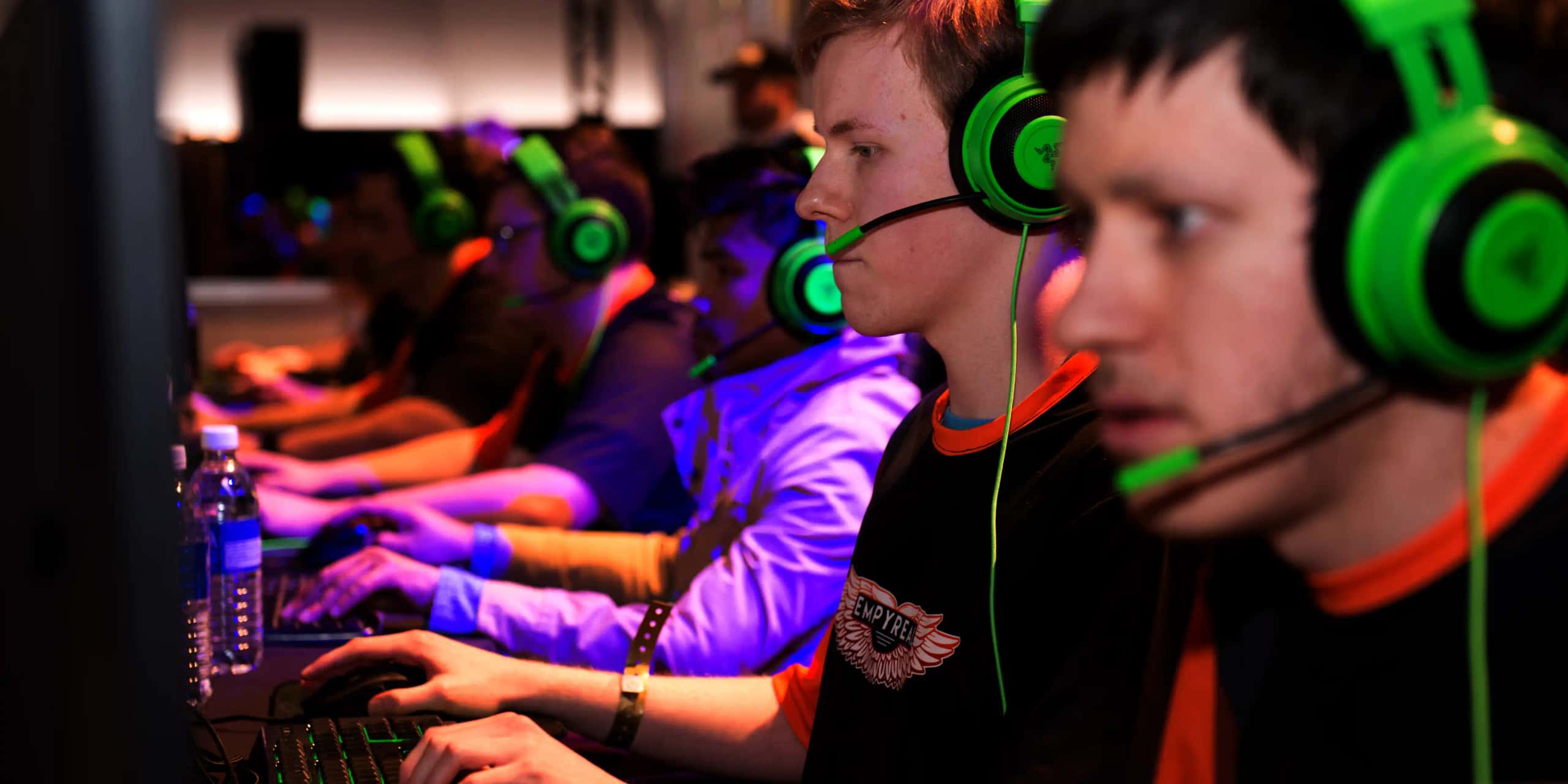
A convention is a brand experienced in person. Every surface is a touchpoint.
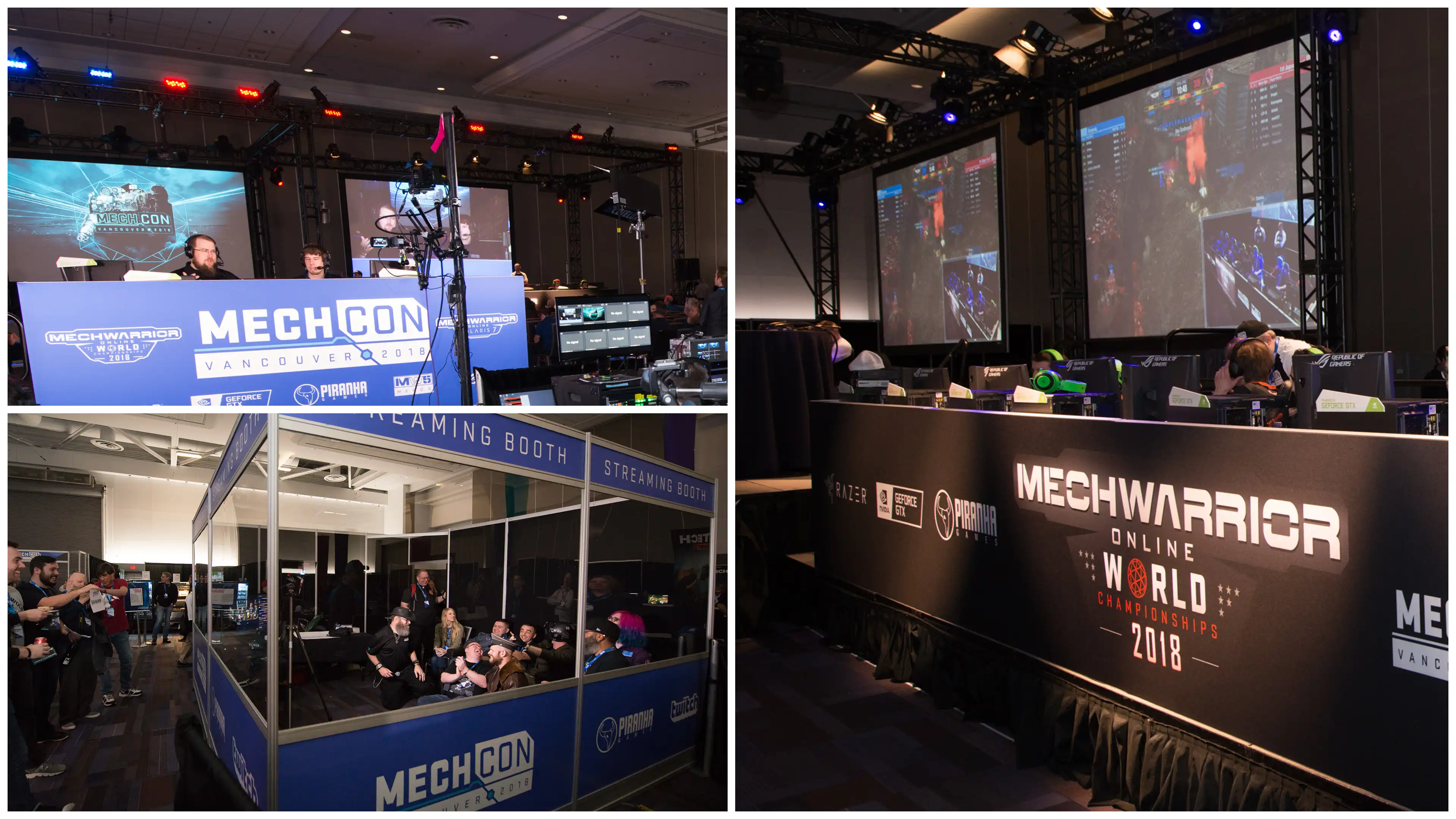
Mech_Con was Piranha's two-day BattleTech convention, held from 2016 to 2018 and attended by fans from around the world. This study covers the 2018 system: one identity applied across a website, merchandise, game streams, video, advertising, venue signage and a MechWarrior Online world tournament, in digital and physical form at the same time.
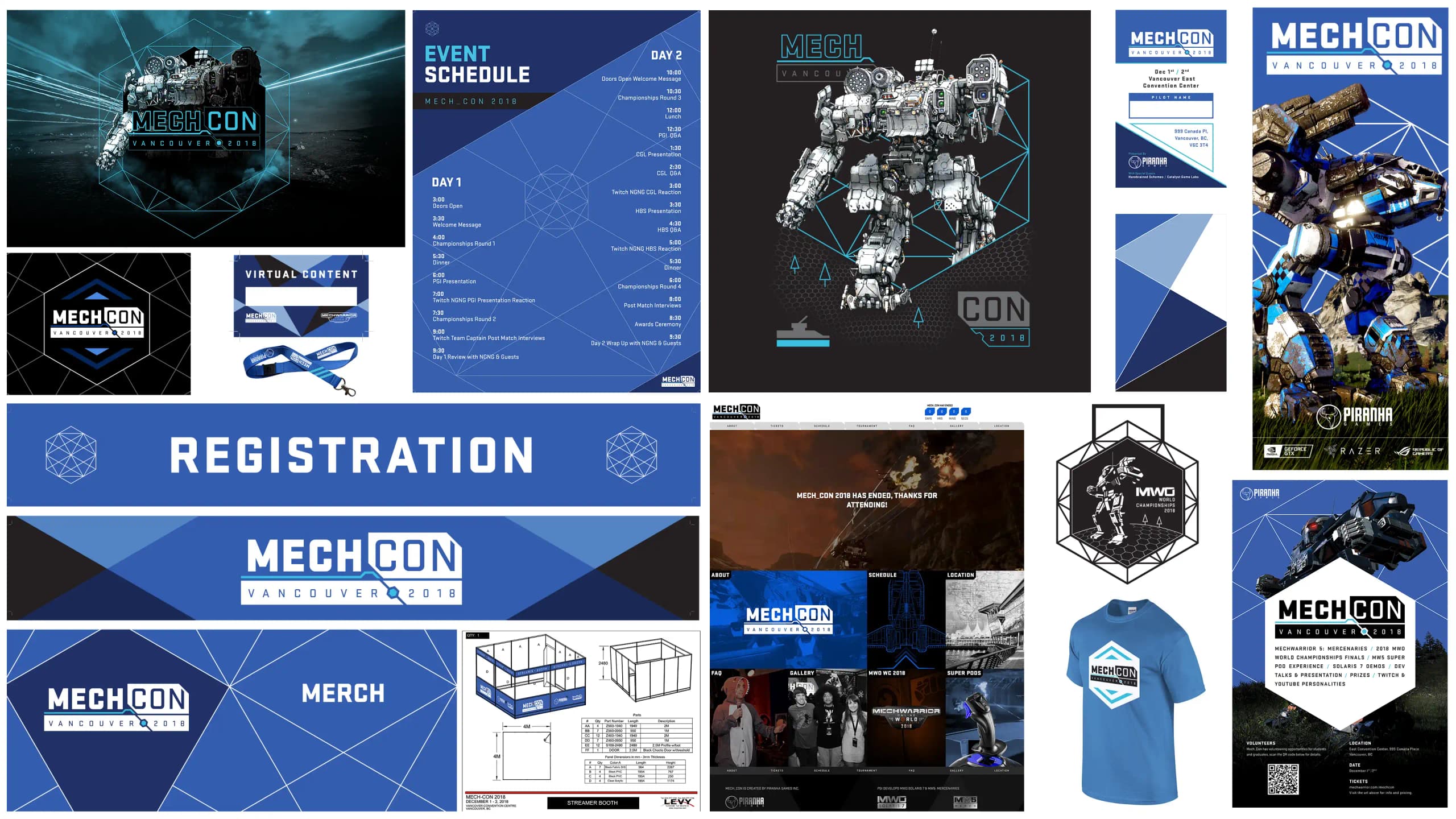
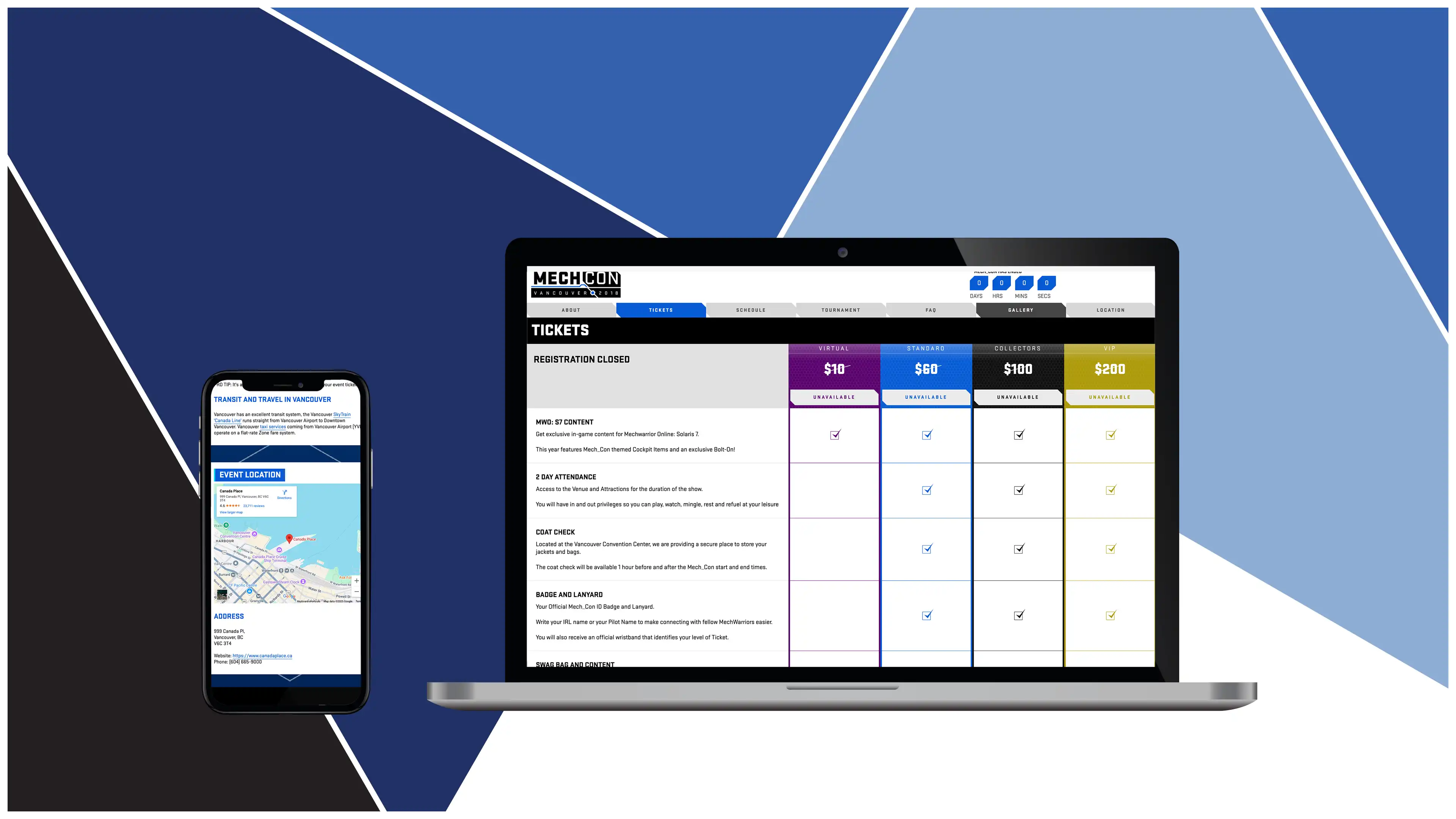
The first step was to update the 2017 logo and write a style guide. Sketching led to a hexagon. It could adapt to almost any use, and it echoed its surroundings: the stage rigs holding the lights and cameras, and the BattleTech board game itself, which is played on a hex map.
The website launched first so that attendees could register, with print collateral following over the months before the event. The style guide carried much of the load. Printers, the staging firm and the marketing team all worked from the same document, so everything arrived looking like part of one system.
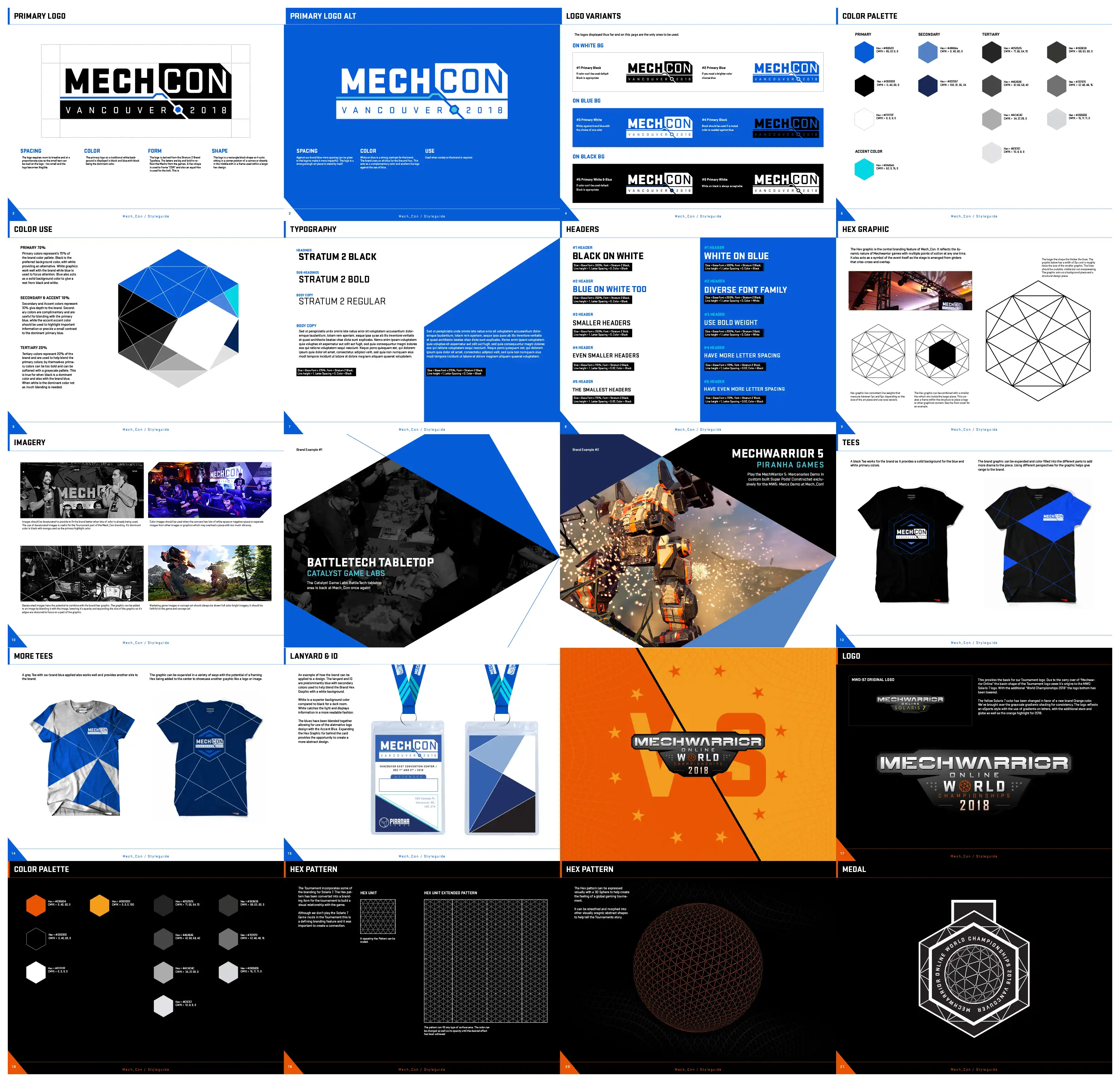
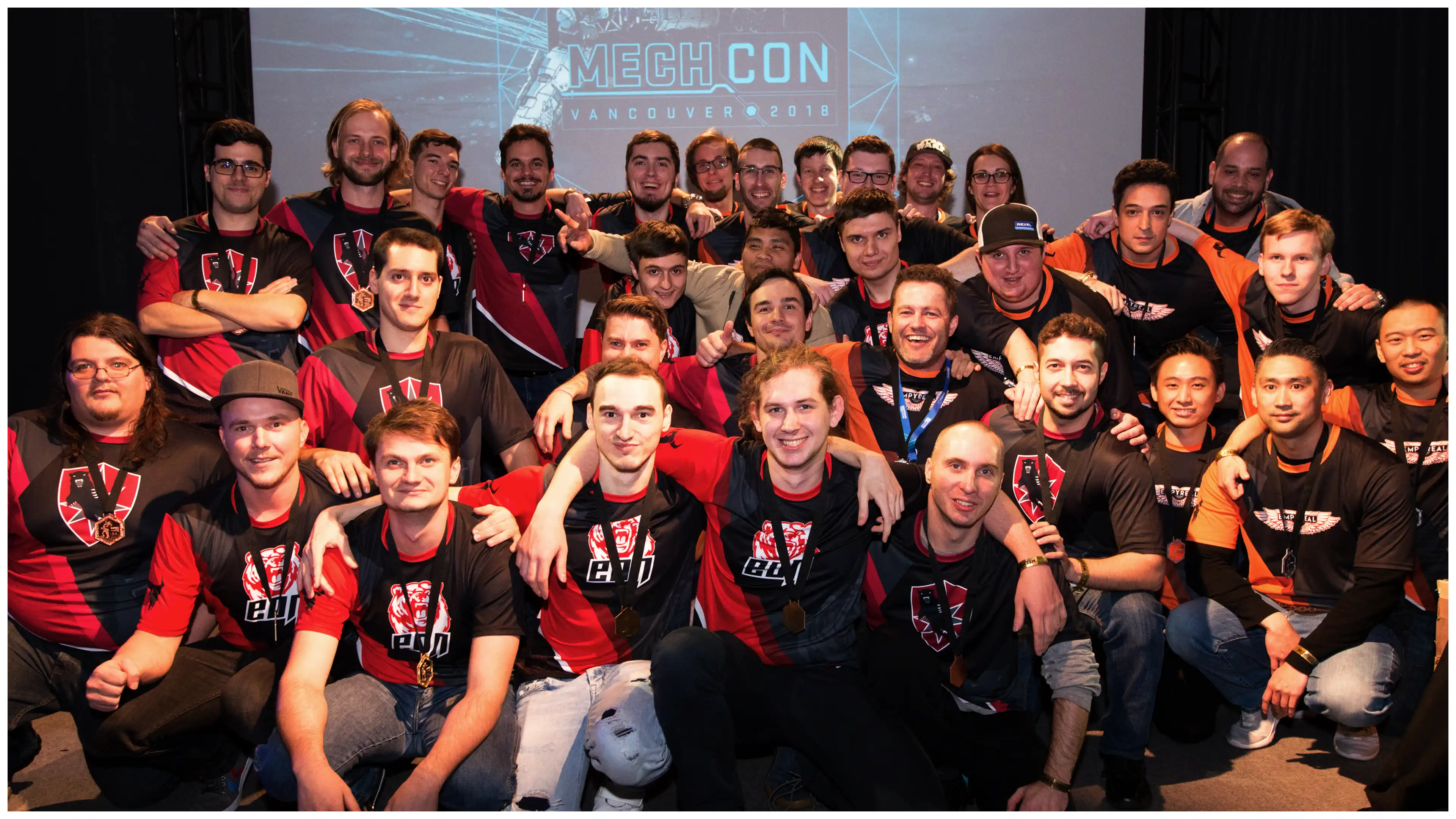
Each tournament team received custom shirts built around its own logo, a separate design problem sitting between the event brand and the tournament brand. Every shirt still carried a hex pattern, drawn to resemble worn chainmail, to keep it within the family.
The tournament identity swapped the event's electric blue for orange and wrapped the hexagons into a globe, a reference to MWO's worldwide player base. A one-off Mech, designed by Piranha's senior concept artist, appeared on the event shirts.
Mech_Con was demanding, with everything converging in the final week, and the hexagon proved its worth. One strong geometric anchor meant fewer decisions and more production at the point where it mattered.