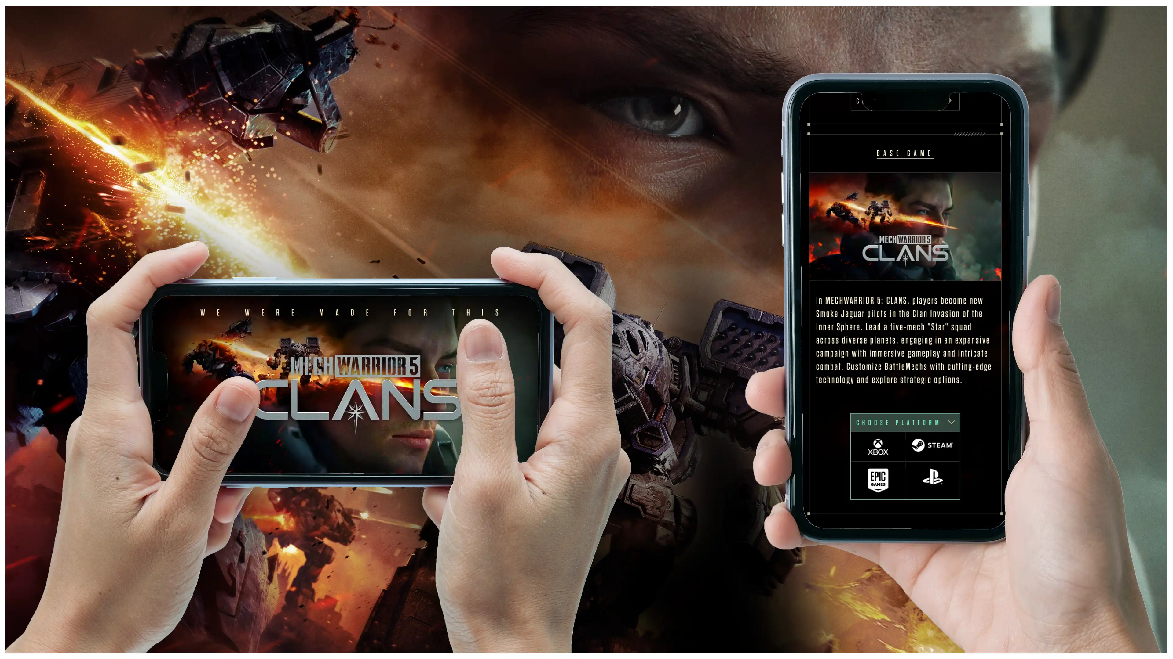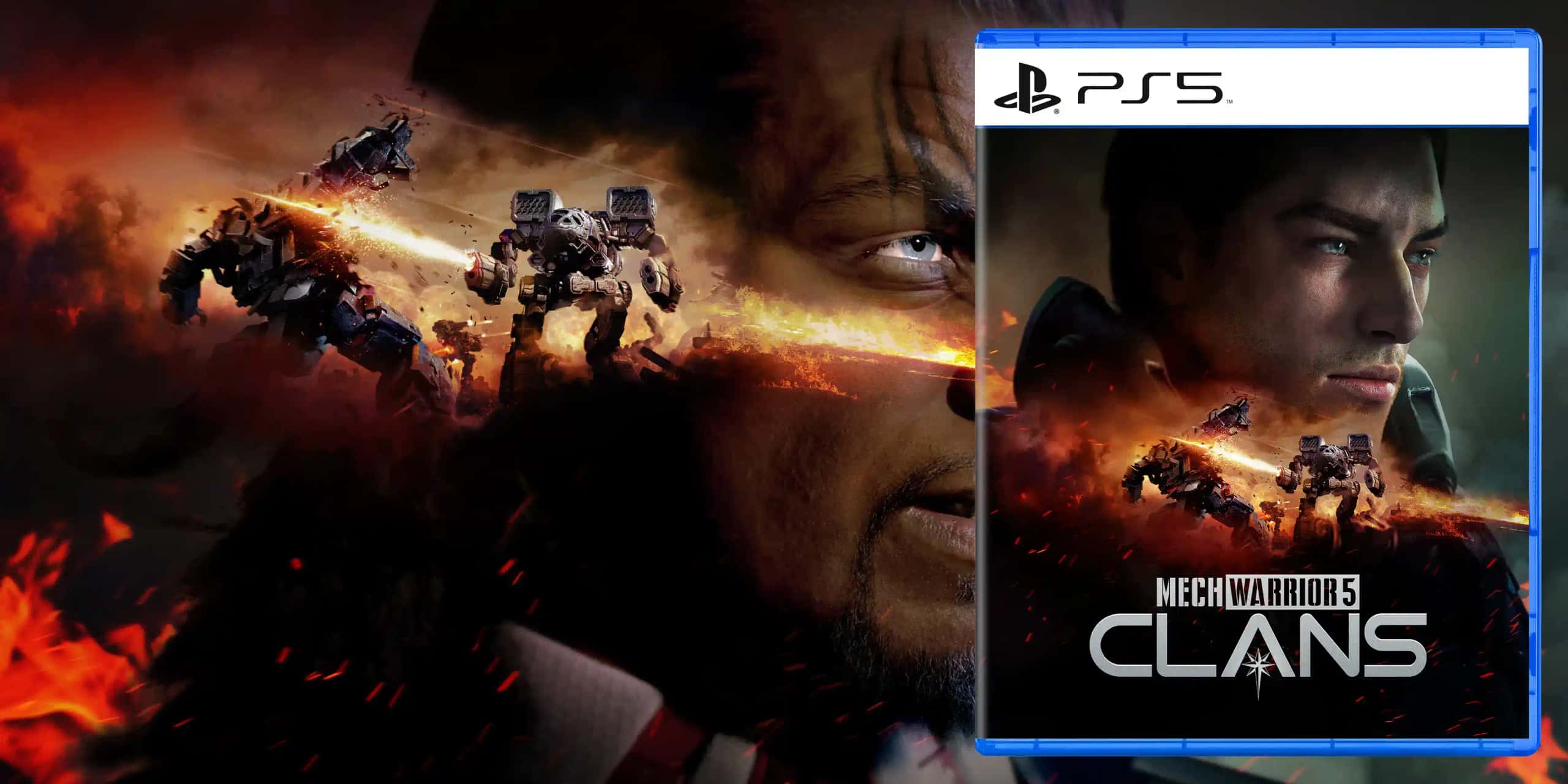
The same universe, but a different kind of game. The brand had to say both.
Clans is a story-driven campaign for up to five players, quite different from the open sandbox of MW5 Mercenaries despite the shared name. I was responsible for the brand and the marketing experience at launch. The first requirement was clear: nobody should mistake this for the previous game.
The story and characters were the real point of difference, so the branding drew on them wherever it could. The logo, site and campaign all pointed back to the narrative.
My starting point was the history of the series. Early explorations drew on the MechWarrior 2 box art: a vertical split through the logo, fire on one side and black negative space on the other.
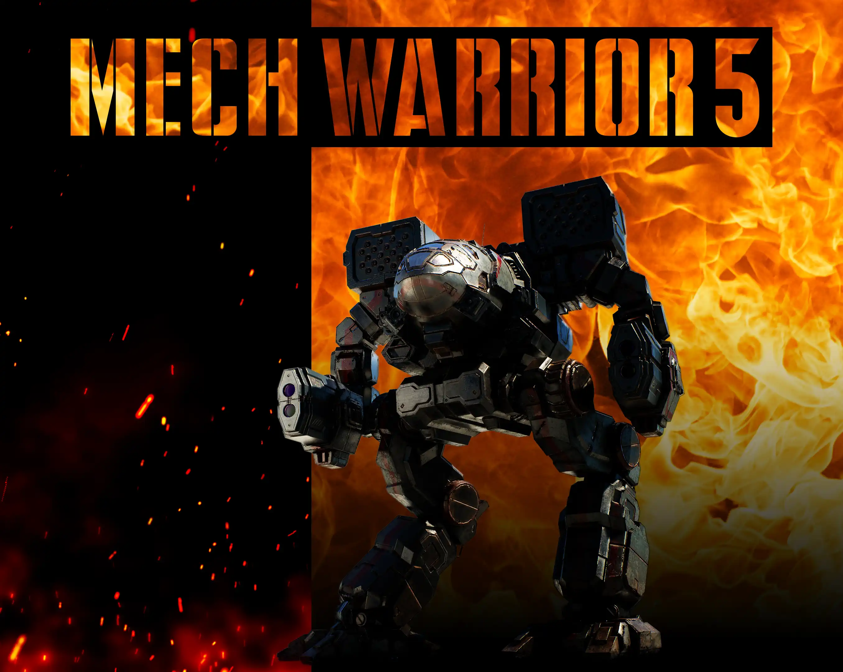
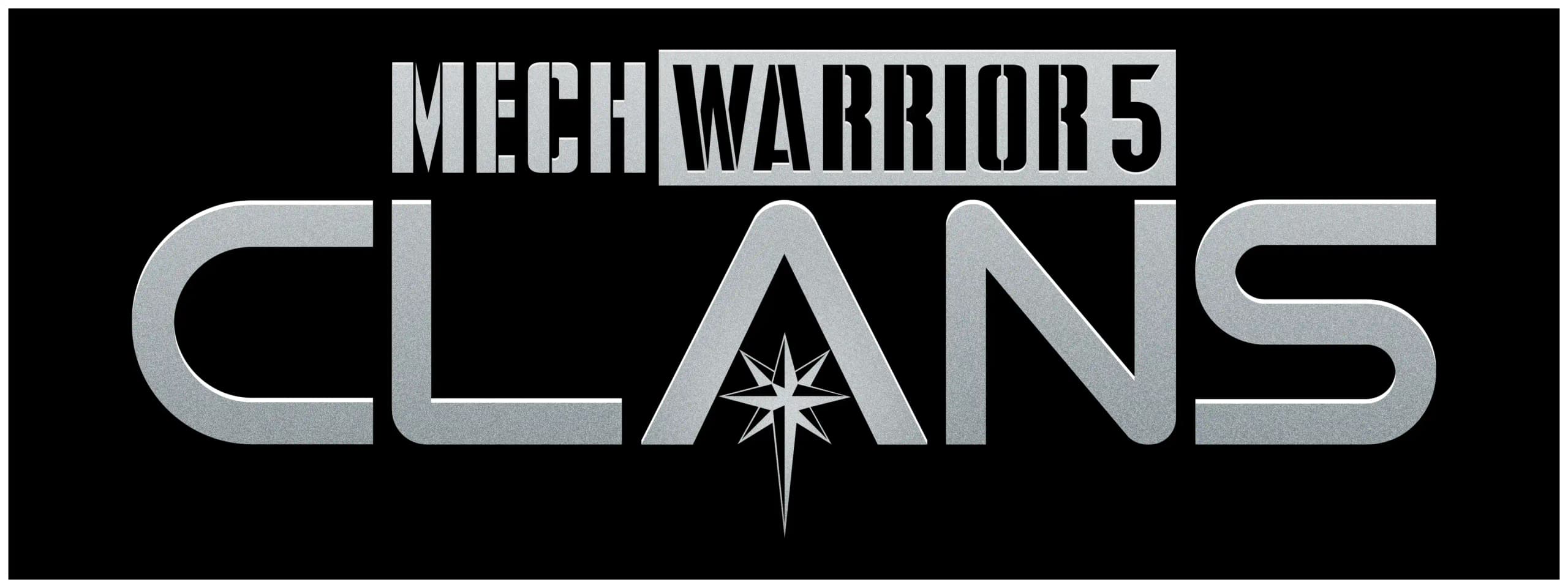
That artwork shaped the logo. The MechWarrior 5 half keeps the stencil lettering as a reference to MechWarrior 2. The Clans half, the invading force in the game, uses modern curves and wider spacing. Two typographic voices stand for two opposing factions, so the mark carries the premise of the story on its own.
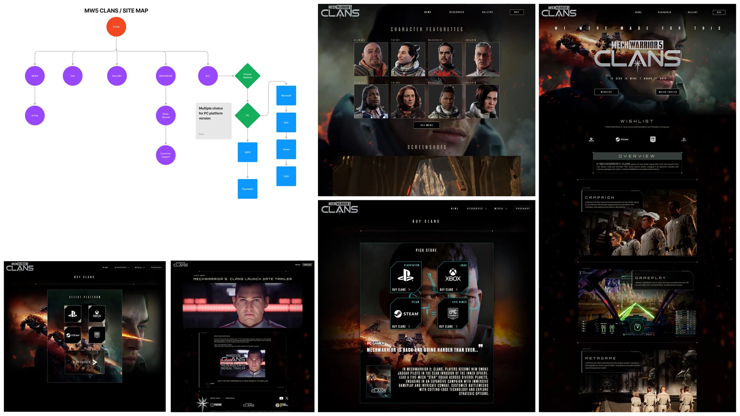
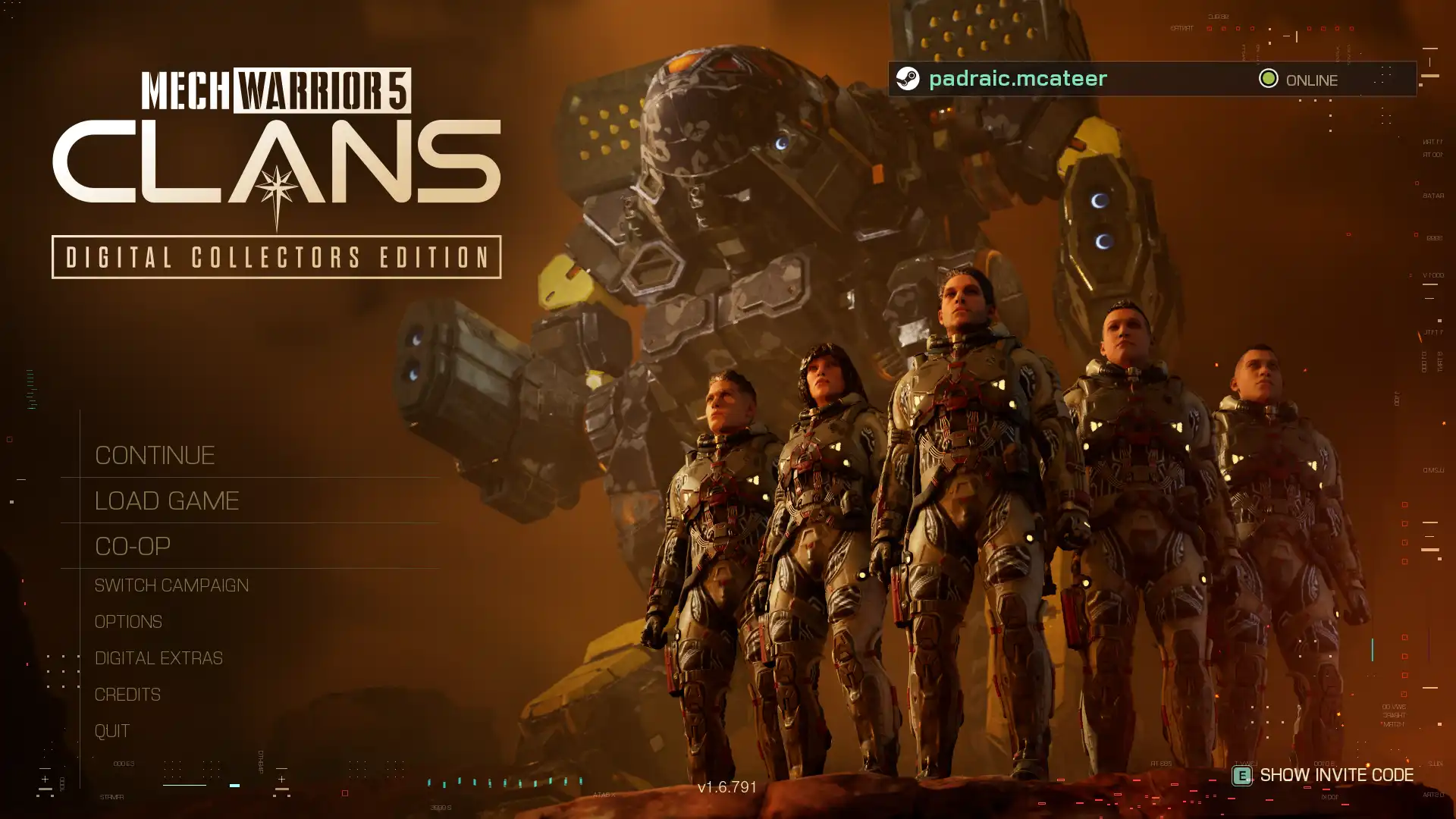
The website had three jobs: present the character videos and trailers, direct players to their preferred store, and feel like the game. I rebuilt elements of the in-game UI as CSS components and used them to frame the site's content, with a colour scheme taken from the key art and the in-game HUD. The marketing and the game read as one consistent thing.
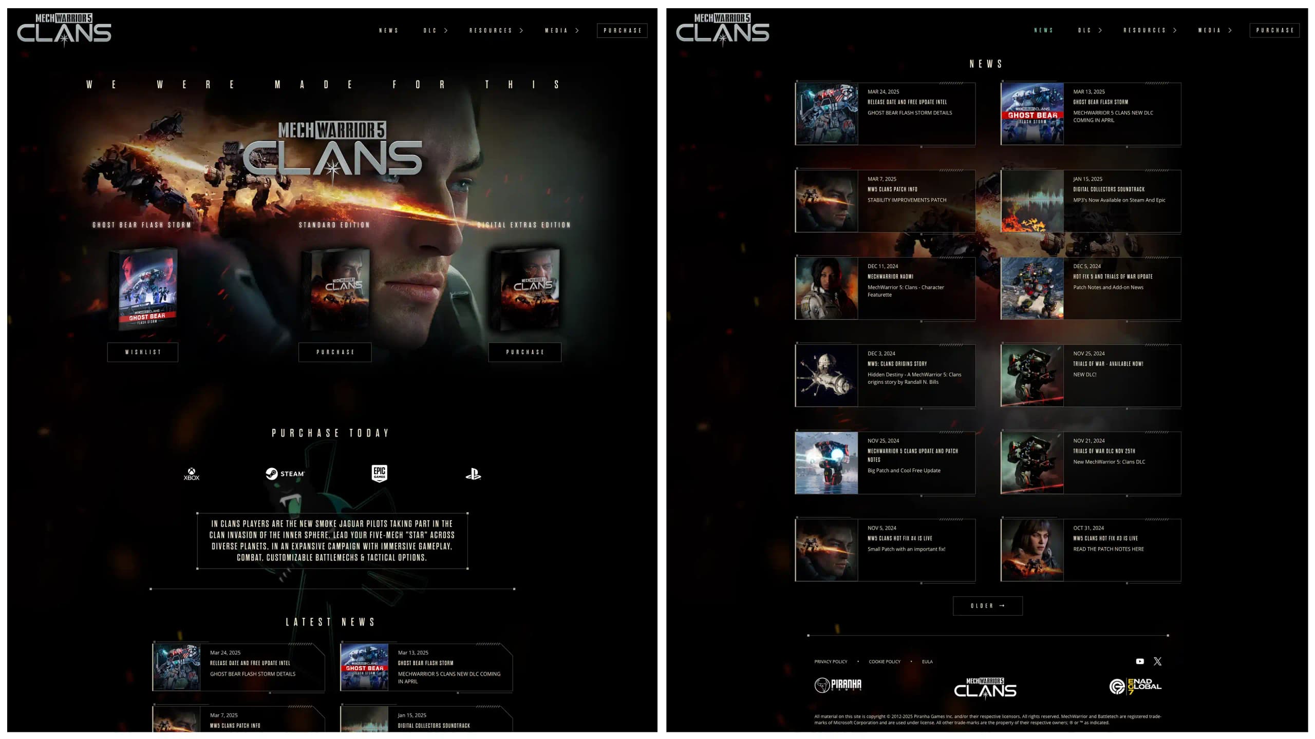
The mobile build received the same attention. WebP images and a utility-first CSS setup kept the responsive work efficient and the pages fast.